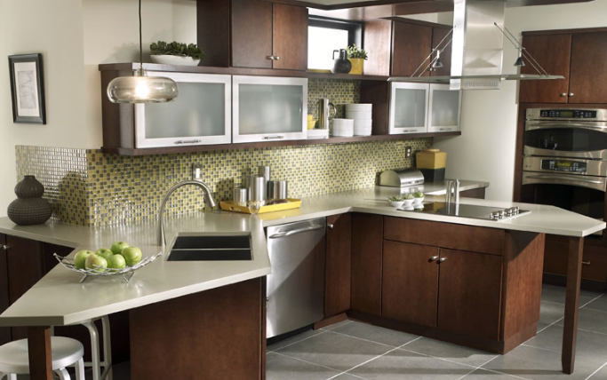
4 Best Kitchen Countertops 2020

kitchen-countertops-ideasReady to choose the right countertop for your home? With so many options like solid surface, quartz, and other materials, how can you choose? For over fifty years, solid surface countertops have durability and a versatile number of styles. Be inspired with these kitchen countertop ideas.
What is Solid Surface?

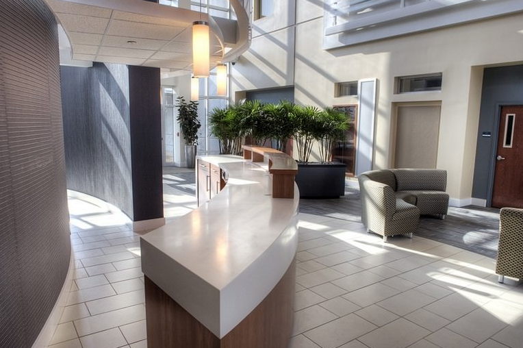
When looking at the best kitchen countertops for 2020, consider solid surface countertops. This durable countertop mimics natural stone but is non-porous. Unlike bouncy laminates, solid surface countertops do not crack or break easily. The material continues from top to bottom, making it more durable under the impact. Want to make a statement? Fortunately, solid surface comes in a variety of styles and colors that will match any of your exciting kitchen countertops ideas.

Solid surface countertops can withstand heat. Homeowners should use a cutting board if they have solid surface countertops. Hot pans may damage the surface if they have a very high temperature. The non-porous nature of solid surface means that cleaning and maintenance are easy.

Wood Surfaces

While wood surfaces can be beautiful they require regular maintenance to maintain their look. Wood can be hard to clean and may get slimy over time. Porous wood does not withstand damage or spills as well as a solid surface.

Granite and Marble

Some homeowners like the luxurious look of granite or marble countertops. This costly option does crack like natural stone.

Tile Countertops

Another popular option this year includes tile countertops. This ornamental option withstands heat. While a beautiful option, tile will chip easily. Heavy impacts can crack the tile. Grout lines need proper sealing to prevent staining from spilled liquids or coffee.

Contact Us

Since 2001 Solid Surface Canada has provided superior solid surface fabrication and installation. We pride ourselves on our attention to detail and adherence to the highest of industry standards. Contact our experienced team today about your kitchen countertop needs. We provide an extensive array of exciting styles, colors, and designs perfect for every homeowner and budget. Trust us to build the kitchen of your dreams. Call us today.


25 Minimalist Countertop Ideas for 2020

countertopsWhether you own a home, have a small business or run a large restaurant chain, you make a first impression the minute someone walks through your door. The right countertops make a statement about your home or business. You want surfaces that emphasize both elegance and functionality, as well as your individual taste. Explore this year’s trending Minimalist design ideas.
Breaking Down Minimalist Design

When we discuss minimalism in interior design, we refer to the old axiom “less is more”. In minimalist design clean simplicity and elegance have priority over the superfluous. In other words, clean countertops in muted colors, neutral tones, and clean lines demonstrate elegance and order. A commercial retail space, office, or home that emphasizes simplicity denotes professionalism and class.

Top Trending Design Ideas

When selecting the right materials for your minimalist design, you can choose from a wide variety of countertop options. Enjoy a great array of colors and styles. Here are the most popular minimalist ideas:

  1. Solid surface neutral tone countertops contrasted with dark cabinets and fixtures
  2. Custom task lighting to maximize utility and elegance
  3. Metallic fixtures in mixed styles
  4. Monochromatic palette in matte charcoal, marble, and white
  5. Accent with natural materials, woods, and unique organic designs
  6. Install a statement chandelier
  7. Leave spaces blank or simply add sparse vases in dark colors to surfaces
  8. Add beautiful geometric art prints
  9. Place lovely vases of lush greenery strategically around the space
  10. Install colorful toe-kick lights or under cabinet lighting for extra elegance
  11. Carefully select which items to display in your home
  12. Avoid cluttering counters and shelving
  13. Coordinate the flow and layout of your space
  14. Choose antique glass materials
  15. Contrast neutral walls and flooring with bold bright countertop colors
  16. Curved and organically shaped counters
  17. Ergonomic design in opal
  18. Simple lines and geometric
  19. Avoid harsh patterns
  20. Use recycled materials
  21. Install stainless steel fixtures
  22. Include hidden storage to reduce mess
  23. Make stunning statements with unique custom shapes
  24. Tastefully combine glass displays with elegant lighting
  25. Always have the guest experience in mind

As you can see, there are countless ways to create an elegant clean minimalist look in your home or business. The minimalist style has the advantage of being easy to maintain and to perpetually looking classy. Unlike other styles like Boho, maximalist, or shabby chic, this clean design is timeless. Combine this style with an industrial look or Scandinavian furniture for a twist.

The Premier Design Professionals

Contact the seasoned design professionals at Solid Surface Canada today. Our friendly staff will happily answer any of your questions. We work with any project, large or small. We pride ourselves on superior artistry and craftsmanship. Call us today.


Kitchen Décor Trends for 2018

Kitchen Décor Trends for 2018Upgrading your kitchen to the latest styles and trends is a surefire way to keep it looking exciting and interesting all year long!  Whether you’re in the market for a complete remodel, or simply swapping out key pieces for a quick facelift, you can make your kitchen feel entirely new by updating to modern styles and trends.  Here are a few big ones for 2018 and beyond!
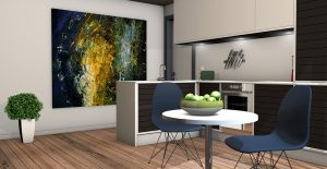
Brass and Aged Metallics

Brass and other aged metallic add a feeling of warmth to your kitchen.  When you used an accessory or highlight piece – rather than the omnipresent feel of brass in kitchens from the ’80s – brass both reflects light and adds a hint of luxury to your kitchen.  Lighting fixtures, switch-cover plates and cabinet hardware are all logical places for a little elegance.

Matte Black

Using black for accents has significantly grown in popularity over the past few years, but glossy black paint can both be off-putting and difficult to keep in pristine condition.  For a softer, and easier to manage effect, try using flatter, matte black pieces as accents.  Chairs and chalkboards are two great ways to add a little flat black contrast to your kitchen.

Dark Floors

Light colors make the most sense for cabinets and walls – they help create the illusion of space, which is key in smaller rooms.  However, if you’re looking to add to the feeling of coziness in a room – or just looking for a large contrast to the greiges and off whites that are so in vogue today – a dark floor can be just the ticket.   If you have wooden floors, a dark stain is a great choice.  Darker tiles or stone floors can also get much of the same effect.

Varied Materials

Mixing and matching from various high-quality material is a great way to make your kitchen feel sophisticated.  High quality wood cabinets and solid surface countertops are a particular favorite of ours, but glass, concrete, stone, ceramic, metal – varying classic and modern styles gives designers a wide range of space to choose from.

3 Ways to Make Your Small Kitchen Shine

3 Ways to Make Your Small Kitchen ShineA small kitchen doesn’t mean you have to have a small sense of style!  Even a small space can shine when given the proper attention and design touches.  Everything from a minor rearranging of appliances to major remodeling can help make your small kitchen into a centerpiece of your home.  Here are some of our top tips to make your small kitchen shine!
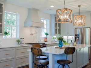
Open it Up

One of the major issues with smaller kitchens is the feeling of claustrophobia they can engender.  With overhead cabinets reaching up high overhead, it can feel like you’re dwarfed by these massive blocks of hardware, limiting the sense of space and light you get in your kitchen.  Open storage, on the other hand, can provide a more freeing and less boxy feeling for your kitchen.  Shelving, pot racks, magnetic holders – they’re great ways to keep the same amount of storage without devoting previous feet of space to cabinets.

Use a Variety of Materials

In a small kitchen, a variety of materials can add visual interest and contrast.  At the very least, it can be more aesthetically appealing than a solid block of white!  A mix of wood, metals and surface materials, when properly chosen and working together, can create a unique style.  You don’t want to go too crazy – you want everything to look somewhat unified and planned – but picking contrasting materials for your countertops, cabinets, flooring and fixtures is a way to add compelling details to an otherwise boring small space.

Use Glass

Opaque surfaces feel like walls and floors.  They limit and set the boundaries of your space.  If you replace those cabinet doors or tabletops with glass, however, you’re suddenly opening up your room even more.  You end up visually expanding your space, even if the physical space remains the same.  Reflective glass – or even just a simple mirror – can also create that illusion of extra space.  Backsplashes are perfect places to install some of that glass tile that can really make your kitchen sparkle.

3 Things You Should Never Do in Your Kitchen

3 Things You Should Never Do in Your KitchenAfter more than 15 years of experience working in and around kitchens, you would think nothing could surprise the experts at Solid Surface Canada anymore.  You would be mistaken!
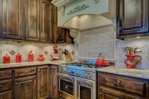
Kitchens are great, multi-functional spaces.  You can do tons of things in them, from cooking to entertaining to family time.  When you use solid surface for your countertops, you have a quite durable room, too, able to handle most of the punishment you could give it.  “Most” is not “all”, however, and here are some things you really shouldn’t do in your kitchen.

Leave Those Spills

Solid surface has advantages over natural stone in that it’s non-porous.  Bacteria and germs can’t penetrate its surface, like it can on granite.  That means spills aren’t as much of a problem on solid surface as they can be on other surfaces.  However, that doesn’t mean it’s a magic surface.  Leaving spills on your countertop overnight is a surefire way to ruin your finish.  Don’t forget to dry, either – letting water dry on your countertop will eventually lead to a film buildup, making your counters look blotchy and uneven.  Wiping and rinsing completely and cleaning up those spills before they dry will prevent those hard water marks from forming.

Forget the Stepladder

Sometimes, a pot or pan is just out of reach, or you need to clean the top of those cabinets.  You may be tempted to just climb on top of your countertops and use it as a stepping-stool to get to those hard-to-reach places.  But watch out!  Countertops aren’t designed to handle the weight of people; it’s designed for cooking activities and appliances.  You wouldn’t want to crack or chip your new countertop because you didn’t go get the proper tool for the job!

Burn, Baby, Burn

Solid surface is more durable than most surfaces, and can stand the heat better than most.  Still, even it has its limits.  Placing a hot pot or pan directly on to your countertop can lead to cracks and burns, even on solid surface.  Trivets and other heat-protectors should be used when handling hot pots and pans to prevent burn-in and scorchmarks.

How to Improve an “L”-Shaped Kitchen

How to Improve an L-Shaped KitchenAn “L”-shaped kitchen layout is one of the best out there.  It’s extremely functional, with everything in easy reach, and it works well with open floor plans, which is the “in” style at the moment.  It’s one of the best layouts to start working with, as its basic function and shape are ideal for an attractive, functional space.
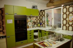
That doesn’t mean you can’t improve it, however!  The experts at Solid Surface Canada have some great suggestions on how to take your “L”-shaped kitchen to the next level:

Customize Your Work Triangle

The “kitchen work triangle” concept states that the main kitchen appliances – your refrigerator, stovetop and sink – should be within a few steps of where you prep the food, forming an efficient and accessible triangle.  Well, that’s true for most people, but perhaps not for you.  Maybe you don’t use your oven very frequently – it might be the microwave you want close at hand.  If you find yourself not using your oven, or rarely using your stovetop, you can move them out of the center of your kitchen, putting regularly used pieces of equipment within arm’s reach.

Raise Your Cabinets

Running out of storage space?  Most kitchens have tons of extra room, just waiting to be exploited – there’s a gap between most cabinets and the ceiling.  For an “L”-shaped kitchen, where storage is often at a premium, extending those cabinets up to the ceiling is a great way to add that little bit of extra storage.

Open Shelving

An “L”-shaped kitchen involves a lot of wall space, as it bends around a corner.  Sometimes, two walls worth of solid cabinets can be difficult on the eye, or a problem for decorating.  Replacing some cabinets with open shelving can create better visibility and break up that wall of cabinetry.

Upgrade Your Countertops

Of course, the best upgrade for any kitchen is putting in brand new solid surface countertops.  Corian, Avonite, Formica – no matter what you have in mind, Solid Surface Canada can help.  Contact us today!

4 Dated Kitchen Designs to Avoid

4 Dated Kitchen Designs to AvoidMost of us don’t redo our kitchens every few years, so the primary goal in a major redesign is timelessness.  You don’t want your kitchen to look like a relic from a bygone era; you want to stick with ideas and concepts that have stood the test of time and are likely to continue to look great for years to come.
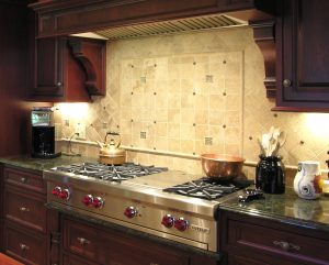
The latest trend may seem great, but be careful – some “latest trends” quickly become ridiculous looking.  As an example, here are some dated designs that were once considered hip and trendy, and now are regrettable.

Dark Brown Wood

Deep, dark brown cabinets can still work in some more classic and traditional kitchen designs – when you’re trying to evoke an older era.  But modern kitchens dump those in favor of lighter and cleaner choices.  Dark colors make spaces feel more cramped and dark.  You can still have a warm, inviting kitchen without going into the darkest colors of the rainbow.

Bright Cabinet Colors

In general, you’re better off using neutral colors for the large, dominating parts of your kitchen – the countertops, the cabinets, the big appliances.  Save the neon greens or the sunshine yellows for accents and accessory pieces – they provide those splashes of color without dominating the room, and can be replaced or repainted easily as trends change and colors fall in and out of fashion.

Florescent Lighting

In the 1980s and early 1990s, big, fluorescent light boxes were the trendy thing to install.  Now, they look garish – and bad lighting can make every other aspect of your kitchen remodel look worse.  Terrible!  Utility and ambient lightning – with dimmers – are much more practical and can easily be integrated into any kitchen design.

Linoleum

The best you can really hope for with linoleum flooring is a kitschy, throwback, retro look.  More likely, you’ll get faded, stained and outdated looks quickly – and it’s probably just going to hide a perfectly fine wood floor.

From avocado green walls to shag carpeting, what’s “in” one day may soon be well on its way out.  We recommend sticking to classic, timeless designs, so your kitchen will continue looking it’s best for years to come.

3 Ways to Add Detail to Your Kitchen

3 Ways to Add Detail to Your KitchenFor understandable reasons, the majority of time planning a kitchen renovation or remodel is spent on the major aspects of the remodel – the cabinetry, the countertops, the appliances and so forth.  That makes sense – they’re the big-ticket items and the most important to get right.
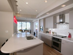
Once those are set, however, you want to add your own finishing touches – you want to add details that makes your kitchen unique, and help it to stand out from the rest.  There are plenty of ways to add this extra oomph factor with minor changes and adjustments, giving your kitchen more personality and adding to the value of your home.  Here are 3 quick and simple ways to add detail to your kitchen.

Crown Molding

The molding provides a transition from your cabinets to the ceiling – a little visual flourish with touches of elegance.  It draws the eye up to the ceiling, giving the impression that your home is well-crafted and solid.  If you’re installing new cabinets anyway, it’s a relatively simple addition to add crown molding – it doesn’t even need to touch the wall to create an elegant look.  Whether you use it to add space between the cabinet and ceiling by placing the molding at a different depth than your cabinets, or custom-design it so the cabinets appear flush with the ceiling, crown molding is a classic touch of detail.

Splash of Color

Most kitchens will be neutral in hue – your basic whites and earth tones.  Picking too garish of a color for your central theme can give you eyestrain when you have to spend time in your kitchen!  However, for the less-permanent, movable kitchen accents—think chairs, dishes on open shelving and lighting fixtures – a splash of bright color can really liven up the room.  Picking, say, lime green for your countertops may not be ideal, because you’re stuck with it until you remodel your kitchen again.  But a bright color for detail here and there can add a little bit of extra zest to your kitchen.

Glass Doors

One way to get that splash of color is with brightly-colored dishes and decorative pieces, and one way to display them is in cabinets with glass doors.  Replacing traditional solid-panel fronts with glass allows your choices in dishware to play a part in the overall look of your kitchen.  There’s a wide variety of types of glass to choose from, as well – fully transparent, frosted, stained, and so forth.  Glass also gives your kitchen the appearance of more space, which is great for smaller kitchens.

Three Remodeling Ideas for Galley Kitchens

Three Remodeling Ideas for Galley KitchensA galley kitchen is a kitchen shaped as a narrow corridor, with appliances and countertops flanking each side.  As opposed to open-floor plans which are the modern style, galley kitchens are designed for small-space efficiency, perfect for one-cook situations but not much else.  One might think that the cramped style would limit the flexibility you’d have in a remodel or redesign, but that’s really not true.  The experts at Solid Surface Canada can help find great ideas to getting the most out of your galley kitchen.

Use Tricks to Make It Feel Larger

One of the main complaints about galley kitchen is that they’re on the smaller side – you’re essentially enclosed on three sides, which produces a cramped feeling.  There are tricks you can use to increase your storage space and make the kitchen feel larger, however, even if you can’t increase its actual footprint.

Extending your cabinets all the way to the ceiling can give you extra storage space, as well as give the illusion of extra height.  Lighter cabinet and countertop colors and reflective surfaces can also help create the illusion of more space, and a natural light source will make your kitchen feel brighter and more airy.

Shrink the Work Triangle

The “kitchen work triangle” concept states that the main kitchen appliances – your refrigerator, stovetop and sink – should be within a few steps of where you prep the food, forming an efficient and accessible triangle.  This works well in a galley kitchen.  If your stovetop and sink are on different sides of your kitchen, consider relocating one in a remodel; this will make clean-up more efficient and prevent clutter from spreading throughout your kitchen.

Remove a Section of Wall

Not all home renovations can include removing a wall section to open up the space, but sometimes, a compromise is possible.  For example, if one wall of your galley kitchen is next to the dining room, a doorway between the two can add extra light and a larger view to your kitchen.

Of course, the best investment you can make in your kitchen is high-quality countertops.  Solid Surface Canada offers a complete range of solid surface tops to meet all of your kitchen renovation needs.  Contact us today!